
An example
When iOS 7 went into beta, I closely followed the evolution of the design as it moved through releases. I endured with the frequent crashes, glitches, and problems associated with a piece of software that is in beta. The fact that my phone crashed every five minutes somehow seemed worth it because I felt like I was in the passenger seat of the product team as they worked out their design details.
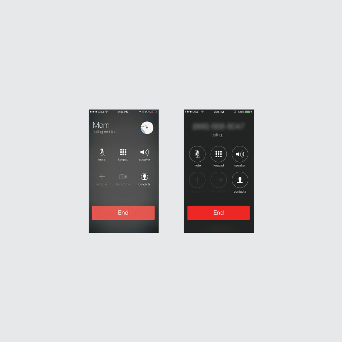
A part of the update that I was especially interested in was the call screen. It was just a few icons, a plain red bar that you could slide to end a call, and some text. Thats it. No fuss. Simple.
But then something changed between the beta 4 and the beta 5 releases. They redid the call screen. The icons now had circle outlines and the ‘end call’ bar was changed.

Why?
I (quite irrationally) disliked this change. I found out that the reason for the changes was due to user testing. People didn’t know they could click on the icon. I found it hard to believe that if someone wanted to mute the call, they would not think to click on the thing that says mute. This was not a satisfying answer. I remember thinking (and probably ranting to my friends) about how Apple missed an opportunity to push their customers. People (millions of people at that) were going to use this interface. Even if the first time they tried to use it it took them an extra second or two to know to click on one of these buttons, they would get it by the second time. It would become normal for them by the third.
I thought that this was an opportunity to undo some of our dependency on oversaturated visual clues, to educate the user away from the double bevels and glossy, lickable buttons of the past, and towards the subtle and refined flat icon instead.
Now, that is way overdramatic. I have come to like the call screen and have seen how it has successfully evolved over iterations. Some of that change in visual literacy is happening to an extent as well. Whether I was off-base or not, I think my response brought up some important questions for me. Namely, what role does user testing play in the design practice, and what is our responsibility to improve our user’s visual literacy?
What role does user testing play in the design practice, and what is our responsibility to improve our user’s visual literacy?

The user is always right…
I currently work at IBM. User research and user testing is a huge part our new design initiative. For decades, we have built products that are not informed by our users and we have seen the miserable place this has left us. We take ‘user first’ very seriously; knowing the user is the only way we can make products that solve their problems. I am definitely not the user of the products that I design. I rely on research to find out if showing REST resources a certain way maps to their current understanding, how often are they going to need to add a new on-premise network, or how many Salesforce objects are they expecting to sync. These are questions that have direct consequences for the designs I work on. They are also questions that I cannot use my ‘design instinct’ on. In a lot of ways, I am dependent on using user research to design a quality product. I didn’t learn how to design an API creation app in design school. I learned how to listen to user’s needs, not what those needs are every time. I do not want to underemphasize my acknowledgment for the benefits of user testing.

…except when they aren’t
But, what I don’t want to see is a world where the role of designer becomes a middleman. It is really easy to take the idea of user first and extrapolate it to things like A/B testing every little design element. The role of a designer has been changing. In the golden ages of design, it was designer as Craftsmen. The designer’s best tool was his hand. This shifted when computers brought machined precision. Now that algorithms can generate infinite variations, the role of a designer could be seen as Curator. His primary tools are his eye and mind. It's not a stretch to imagine this role being instead delegated to the user. What color blue does the user want? The designer is then restricted to solely researcher, facilitating the testing and serving up what the user says they want. But, what about designer as expert. That’s a title I wouldn’t mind. Because, let’s be honest, users are often wrong. I admit I was wrong when I first judged the iOS 7 screens. Think about how often people complained whenever Facebook changed their layout. Do we really wish we still had the 2007 version? Testing is a very important tool in a designer’s repertoire, but it is one of many.

Finding Balance

So where is the balance between user testing and designers trusting their expertise to make decisions? I think to answer this, we need to look at the process of creating. In Allen Hurlburt’s book, The Design Concept, he explains some of Freud’s theory with this diagram. The creative process is broken into steps. These steps take place in both the analytical and the intuitive parts of our brains. I believe the distinction between analytical decisions and intuitive decisions is a fitting one. We have analytical concerns: does this solve the actual problem? Do people understand it? Is it a minimal viable product? This analytical realm deals with binaries and objective truths. Users help us answer these questions. But that does not create great products alone. We cannot neglect the intuitive side of the creative process.

Teachers of what?
There are certain decisions that we should not delegate to our users. Through experience, practice, and education, we are able to go beyond the user’s expectations or imagination. The fact that we as designer’s have ‘expertise’ implies that there will be times that we will decide things that the user would not have chosen. This is ok. When we expose users to designs over time, we change their expectations. Designers shape the users’ visual literacy. We have a responsibility to progress it.
“Even if it is true that the average man seems most comfortable with the commonplace and familiar, it is equally true that catering to bad taste, which we so readily attribute to the average reader, merely perpetuates the mediocrity and denies the reader one of the most easily accessible means for esthetic development and eventual enjoyment.”
— Paul Rand

Rand believes in the concept of ‘aesthetic development’ and sees designers as agents that can make it happen. When we push our audience past the familiar, we are changing their visual literacy. It is clear that our aesthetics have changed over time; our principals of beauty are constantly being reinvented and modified. Is this change in our visual literacy just simply change or is it progression? If progression, then what is it progressing towards? Progression implies a destination. When teaching our users, we need to know where the goal is.

Where are we going?
The place that this development is the most clear is in type design. The way that we have chosen to draw letters has changed drastically over time. While we struggle to read type set in blackletter, our medieval friends would have a similar problem with text set in Helvetica or Georgia. It is not just time that impacts our visual literacy either. Take for example the lettering of different subcultures. The way that we draw letters has been developed for centuries by countless people, cultures, and generations. They have all left this practice in very different, unique places. The way that we receive communication and assign value is unique to our context. This context is made up of many factors (time and location being some, but only some of many). It is because of this that I believe there is no ‘absolute beauty’ when it comes to design, no golden standard that a design can be held against devoid of its context. I think that there is truth in Rand’s words about aesthetic development, but I don’t think that the direction in which we are developing resides in the visual or concrete.
This means that the goal is not a stationary target. Just like a mathematical function gives us a different value based on what we input, the ideal design decision is highly dependent on the variables surrounding it. I call this context. When we talk about design, we are not working with simple solve for x equations; we deal with complex landscapes made up of many unique users. Time is one variable, location is a variable too, so is the age of our user, and the industry we are in, and the previous experiences our users have encountered, and so on, and so on. These equations ask us to solve for the whole alphabet.


Solving for variables
The design research process is about filling in this context so we can give our designs the best chance of resonating and communicating. Some context is static. The way that our human eyes react to and perceive light is a set part of our biology. The ingrained patterns and mathematics of our universe set part of the scene as well. Our basic design principles are all reactions to the constant aspects of the world that we live in. That doesn’t paint a nearly detailed enough picture of the environments that we design for. We use our user research and user testing to fill in the gaps.

Setting Expectations
But what about teaching? If there is no single archetype of visual literacy, what then do we try to develop our users’ aesthetics into? What we teach is not to love helvetica or hate drop shadowed comic sans. Or even to prefer gracious white space. We need to step back from what they like and ask why they like it. We should be teaching users to appreciate bespoke and contextual design, because there are times that Helvetica is not the right choice. By learning why helvetica works in some scenarios, we are able to know why it won’t work in others. The way that we train users to care for and seek contextual designs is to keep serving them designs that cater to their unique needs and presumptions.
In some ways we need to teach our users to be spoiled. And if we are lucky, we will get users who hold us accountable and end up teaching us.
Janruary 2016
See on Medium