The rise of MARTA
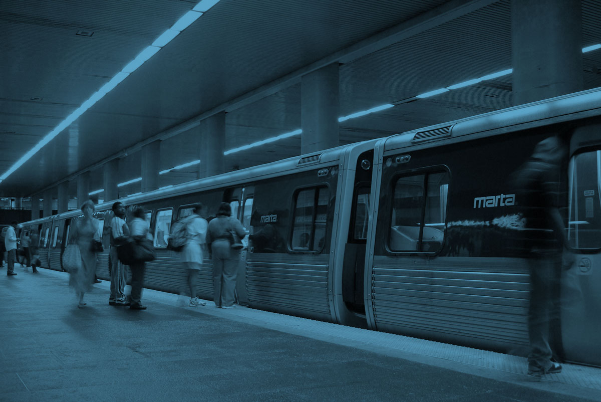
MARTA (Metropolitan Atlanta Rapid Transit Authority) is the primary public transportation system in Atlanta. As the 8th largest transportation service in the nation, MARTA transports over 420,000 passengers a day. MARTA has both a subway system and a bus system that operate between 38 rail stations and over 100 bus lines.
MARTA was the envy of other cities when it was initiated in 1972 and promised to connect Atlantians to the whole of their city, for both work and play. The birth of MARTA represented a milestone for technology and development in Atlanta.

“The main goal of MARTA was mobility; mobility is man's fifth freedom. [The lack of mobility] imprisons people in their neighborhoods.”
— Sam Massell
What went wrong?
Once a source of and awe pride for Atlanta, MARTA is now unfortunately more closely associated with crime and lack of upkeep to some. MARTA's interaction with its customers is hindered by dated aesthetics, inconsistent design, and ineffective and unclear communication.
MARTA feels far from modern. Its inconsistent typography illegible wayfinding, and clunky website and app devalue its brand.
Opportunities
Some problems with MARTA are operational (the inevitable reduction of service and increase in fares due to economic restrictions), but by using clear, consistent, and engaging design throughout its touch points with riders MARTA can increase its ridership and its quality of user experience.
Mobility allows Atlantians to experience Atlanta to its fullest.
Typeface
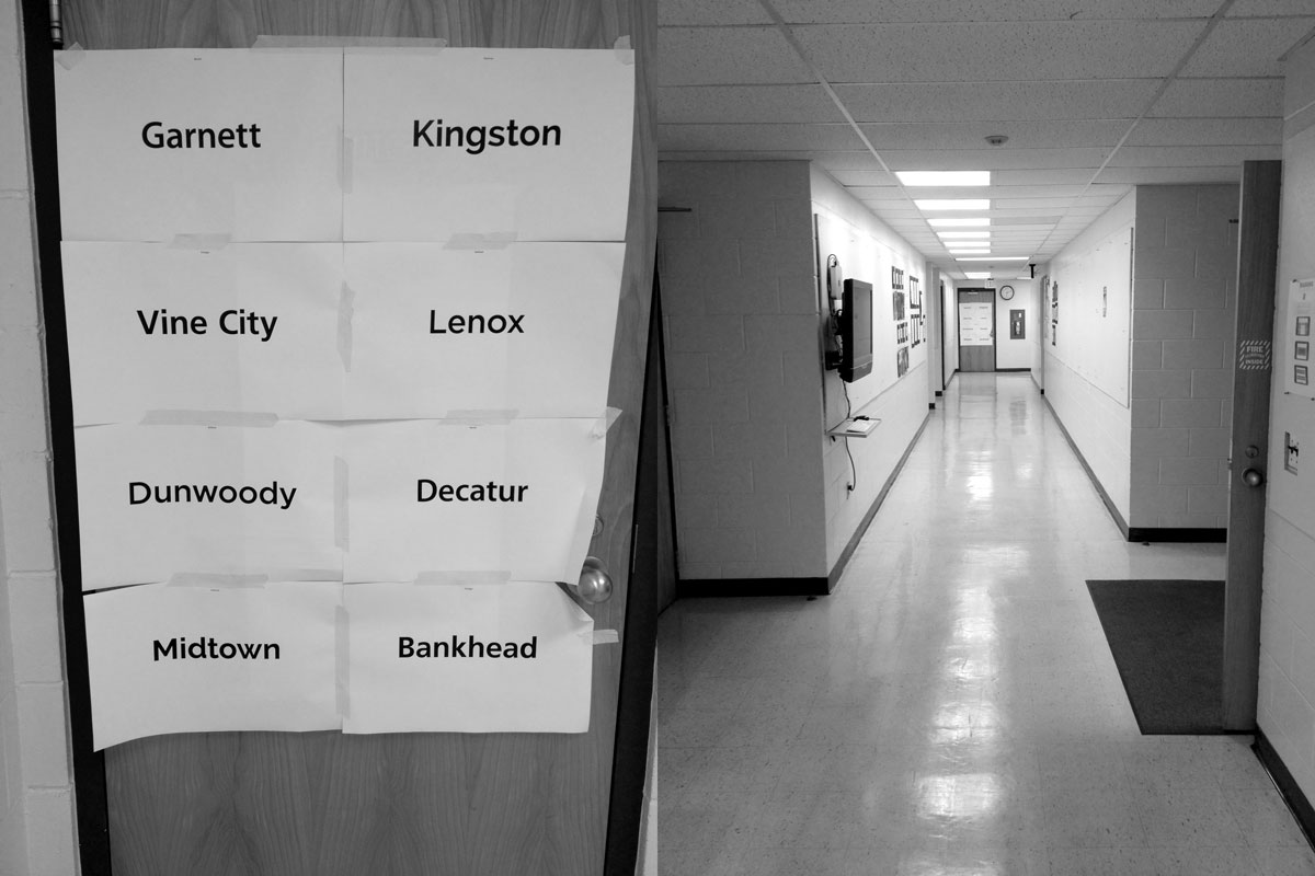
One of the major problems I had when using MARTA was that the type was very illegible from distances and angles, so I wanted to address this first in my redesign. Marta’s current typeface does not meet the standards laid out in the ADA. I tested different typefaces legibility by hanging printouts at the end of our hall and getting classmates to try to read them. I found that Gotham preforms well from an accessibility standpoint and appropriately communicates the proposed MARTA brand.

“A typographer who hasn’t found the appropriate typeface may not have decreased the informational value of a text, but gave up the opportunity to considerably increase its effectiveness.”
— G.W. Ovink
Logo
Arguably, the most iconic part of a brand is the logo. It is the most explicit in identifying a company. I started with the idea that MARTA consists of two interconnected systems. The concepts of mobility, trust, movement, and modernity were important to the branding.
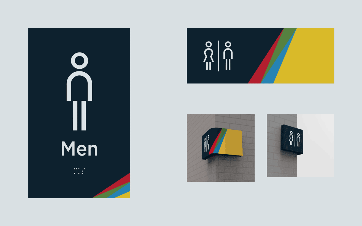
Icons
Since the icons would always be sitting next to type, I took inspiration from the typeface when I constructed the various icons that I needed. By deconstructing the letterforms, I was able to pull out key building blocks. I used the same curves and length ratios of Gotham in the icons. I then tested the icons with peers to make sure they properly communicated what the represented.


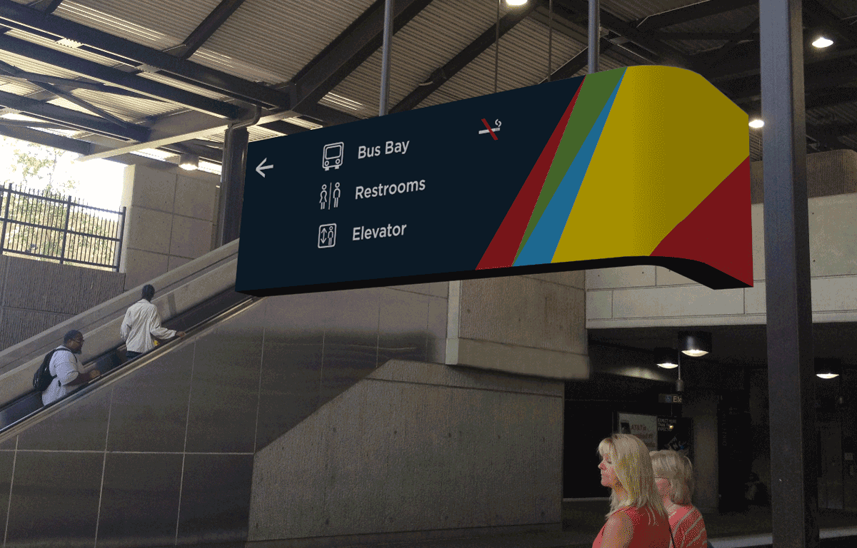
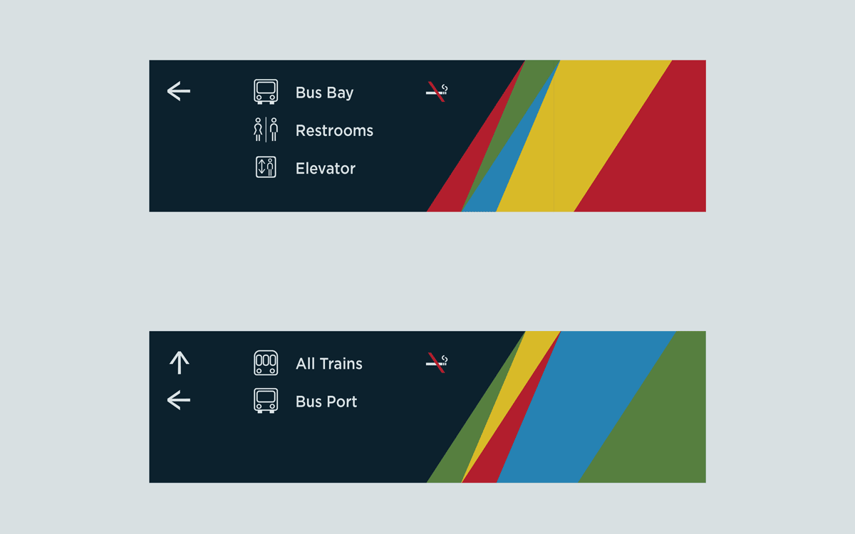
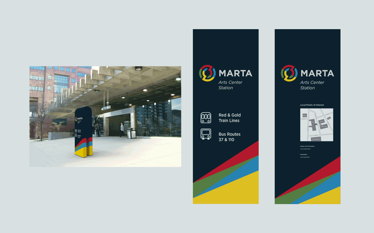
Wayfinding
The main way that users interact with the design is though signage. The wayfinding for a major transportation system has a lot of functional requirements, architectural restrictions, and accessibility rules. The main responsibility of way finding signage is to help riders when they reach a decision point. A decision point could be using an elevator, going to a train platform, or transferring to a bus. I created flow charts to map the paths that a rider could take in order to find out where and what type of signs were needed. Each station has a different layout, so I rode around and documented studied the different stations.
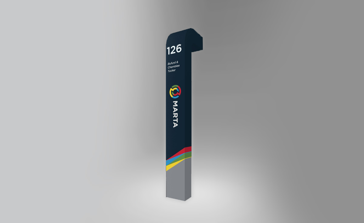
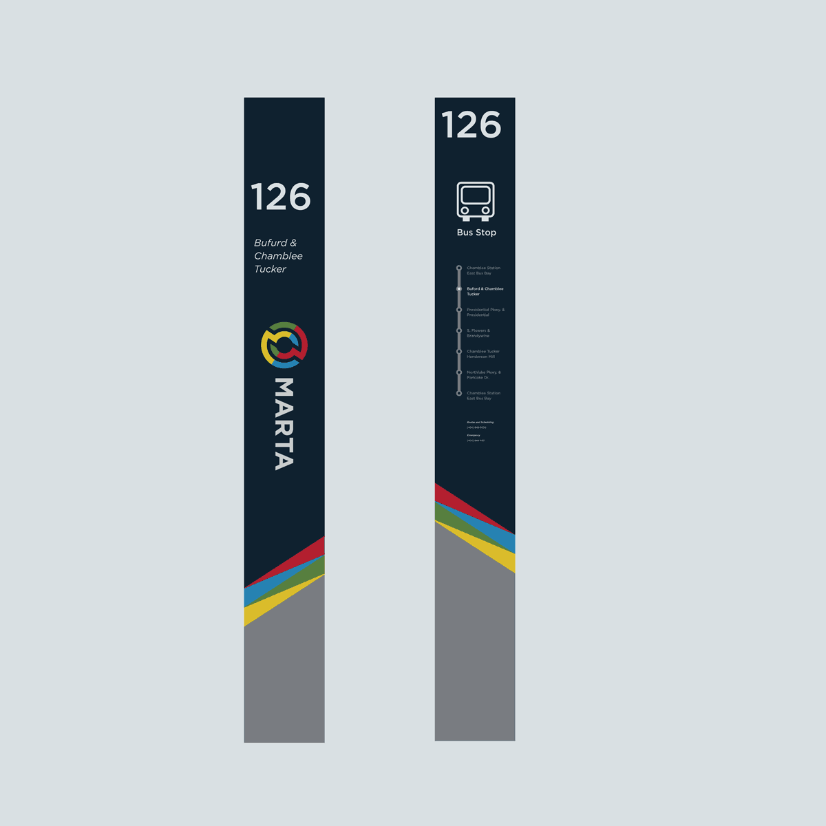
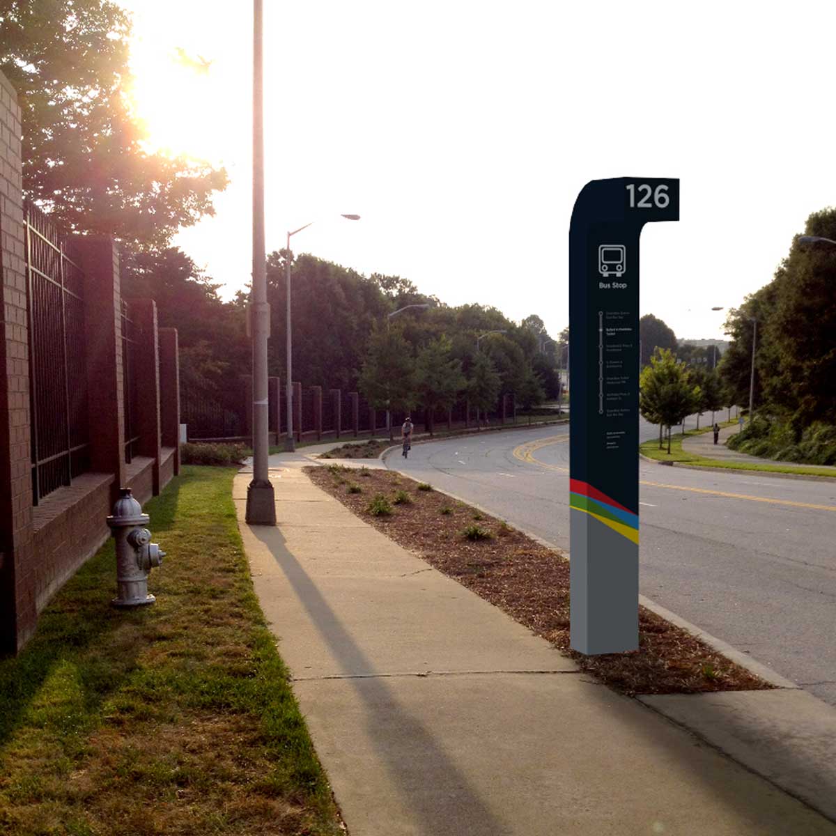
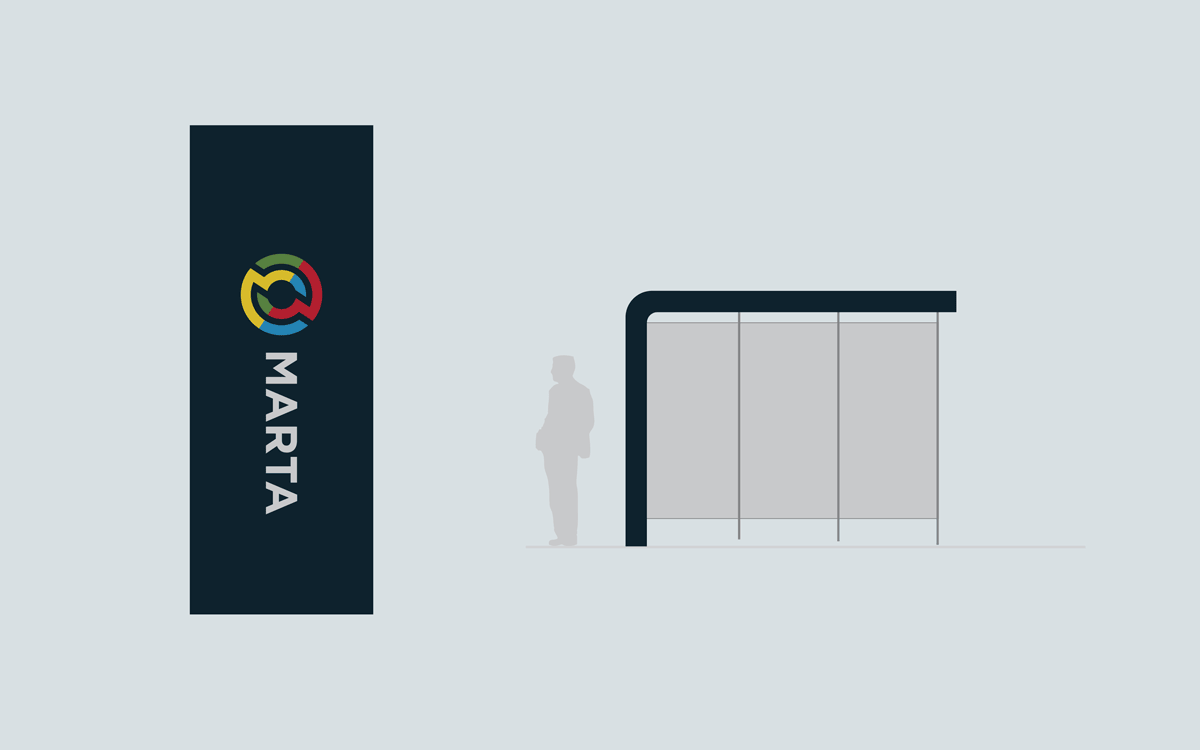
Bus Stops
Both Former Mayor Sam Massell and Assistant General Manager Ryland McClendon mentioned the lack of public awareness and utilization of the bus network when I talked to them. Signs for bus stops are not impactful or visible enough and are often overlooked. My proposed bus stop signs aim to give the system a more tangible presence. The new designs also allow for more contextual information.
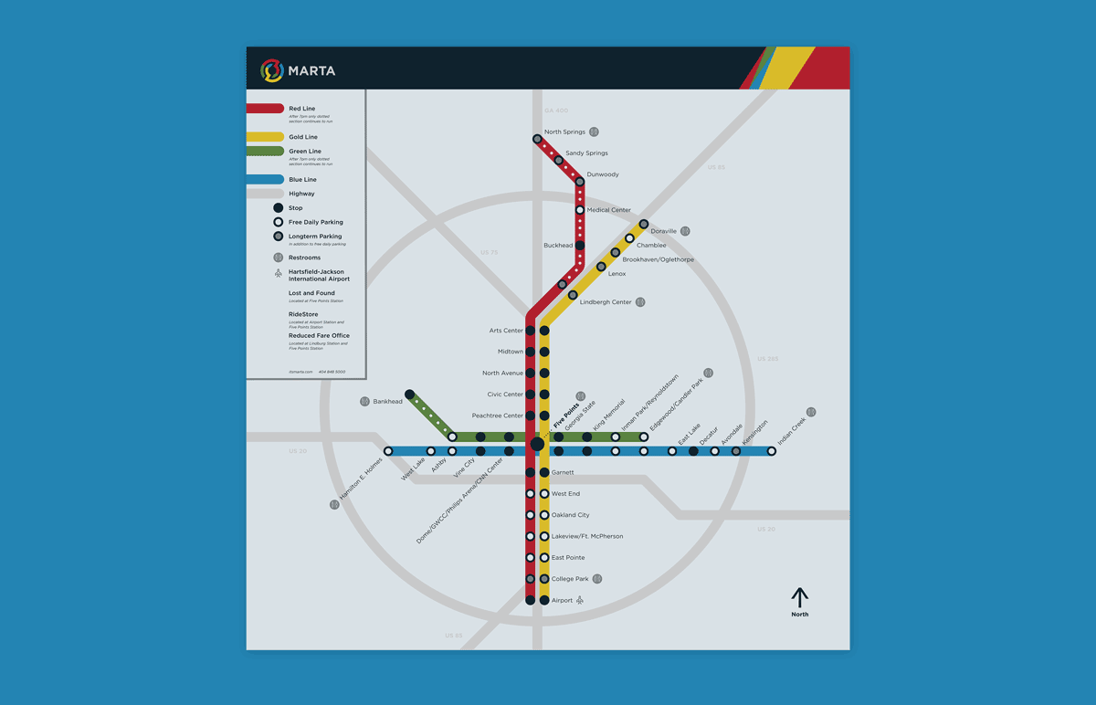
Map
MARTA’s current map sits somewhere between geographical accuracy and simplified abstraction. Most people have trouble recalling regular shapes. I redrew the map using simplified geometry and focused on decluttering information.
“You can't understand a city without using its public transportation system.”
— Erol Ozan
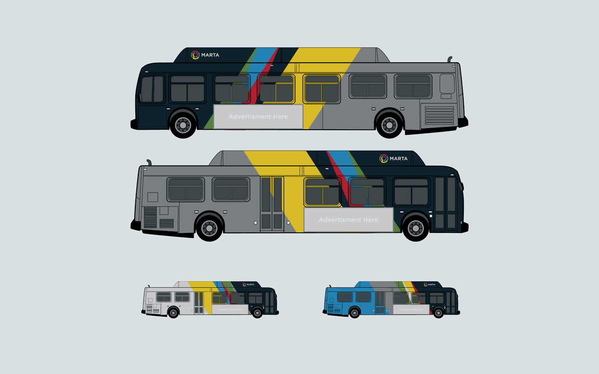
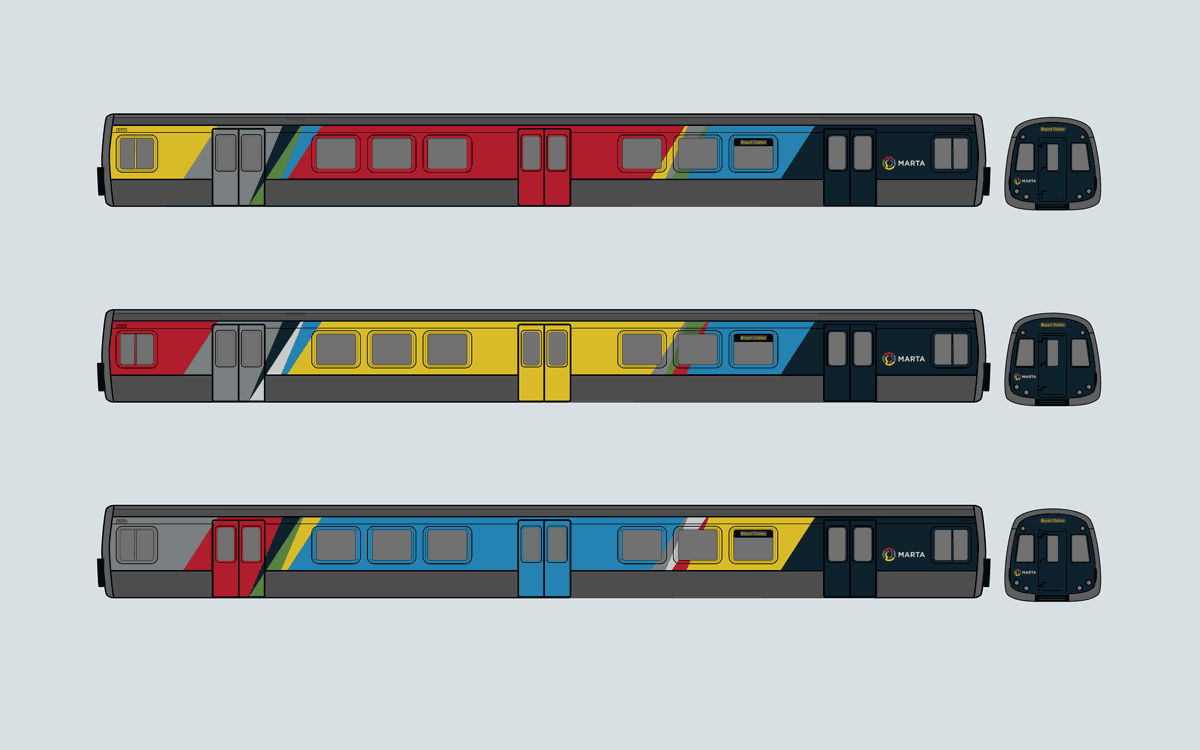
Vehicles
The vehicles are a great platform to extend the visual identity system and bring recognition to the MARTA brand. Variations of color help the buses stand out in the traffic and the graphic treatment makes them more approachable.

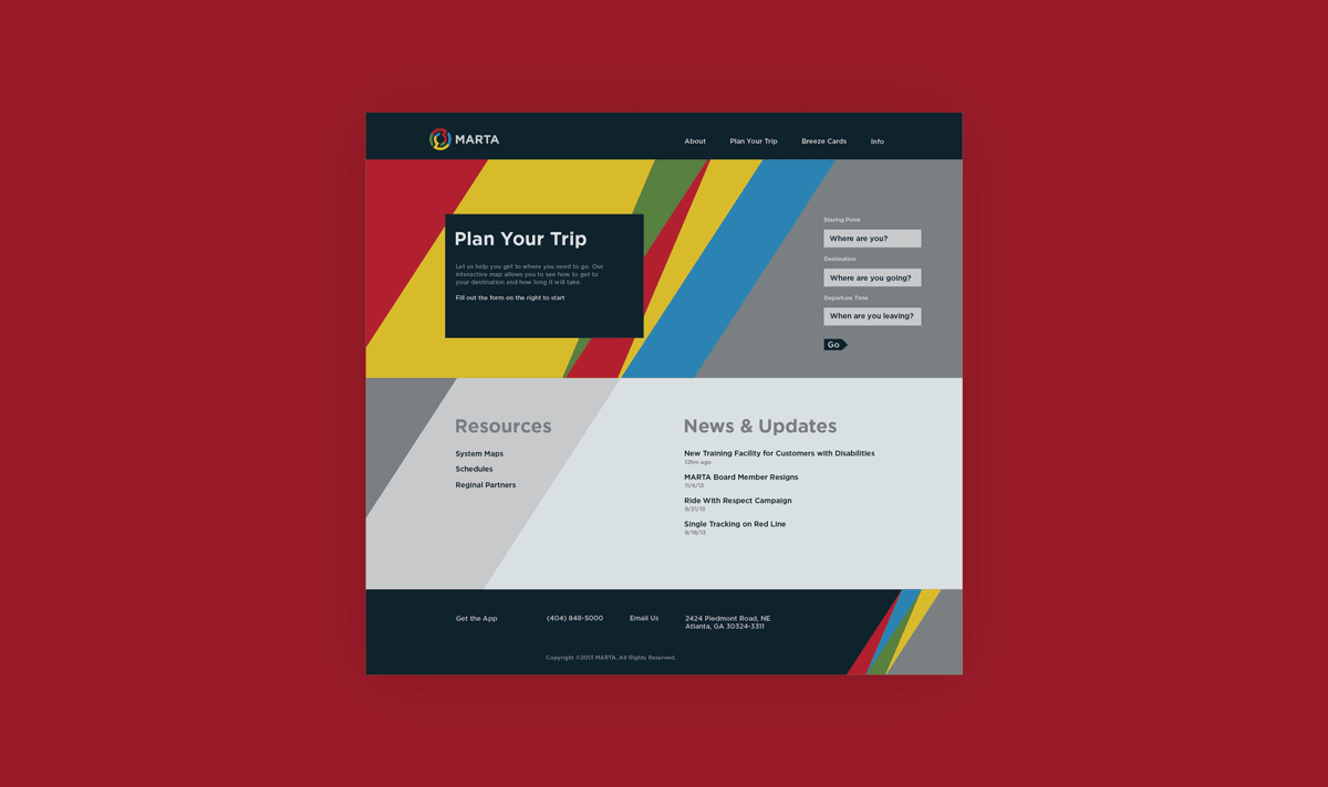
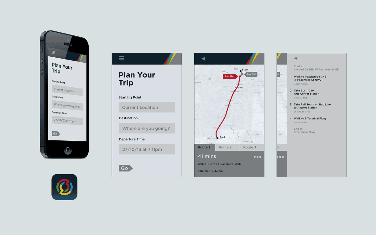
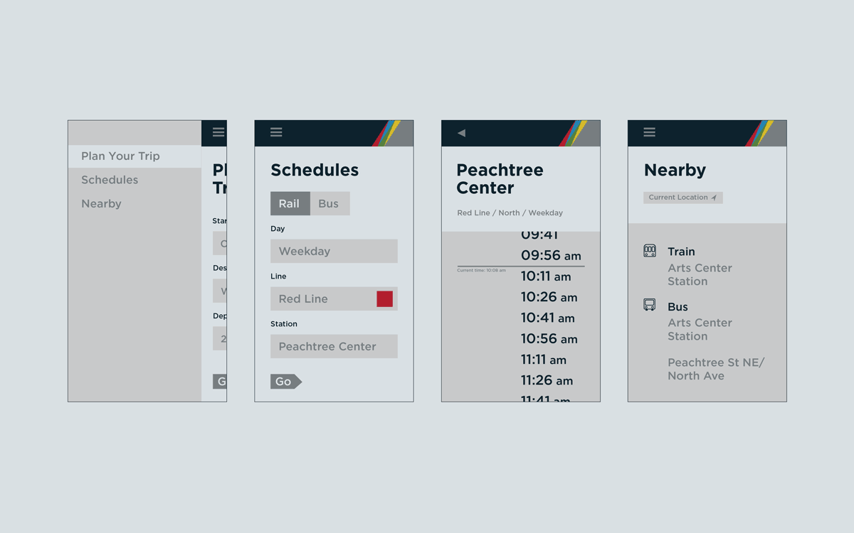
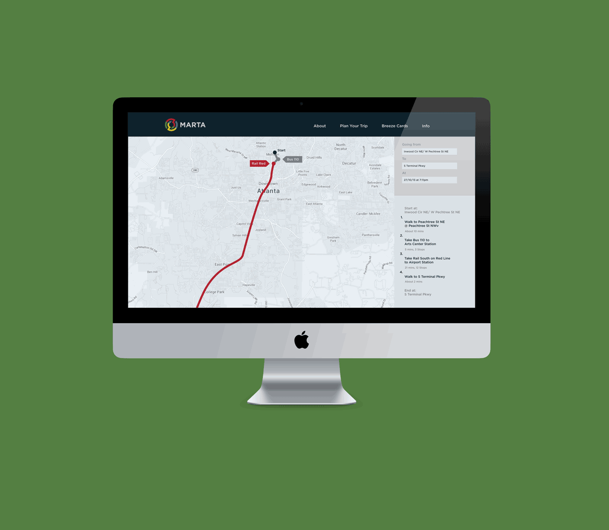
Digital
A major problem that I have when using MARTA is dealing with their website and mobile app. Obfuscated under layers of subpages and visual clutter, most of the important tasks a rider needed to preform are painful experiences. I spent time distilling out the most important features and reworking the sitemap.
∴